It’s fashionable to believe that crypto day trading is an easy way to make money (read up on the facts here.) The truth is that successful traders work very hard and scrutinize the price movements of cryptocurrencies to predict future movements, using technical analysis.
Cryptocurrency traders analyse price candles and trends to help them predict market movements. We will tell you the ins and outs of trading candles in this article and show you how they can be used to make trend predictions, giving the foundation to make your own technical analysis.
What is a Candle in Technical Analysis?
Candles are an illustration of price movement. They can either be bullish, bearish or neutral. The thing to know about interpreting candles is that it is not an exact science. You are better off thinking of it as an art form.
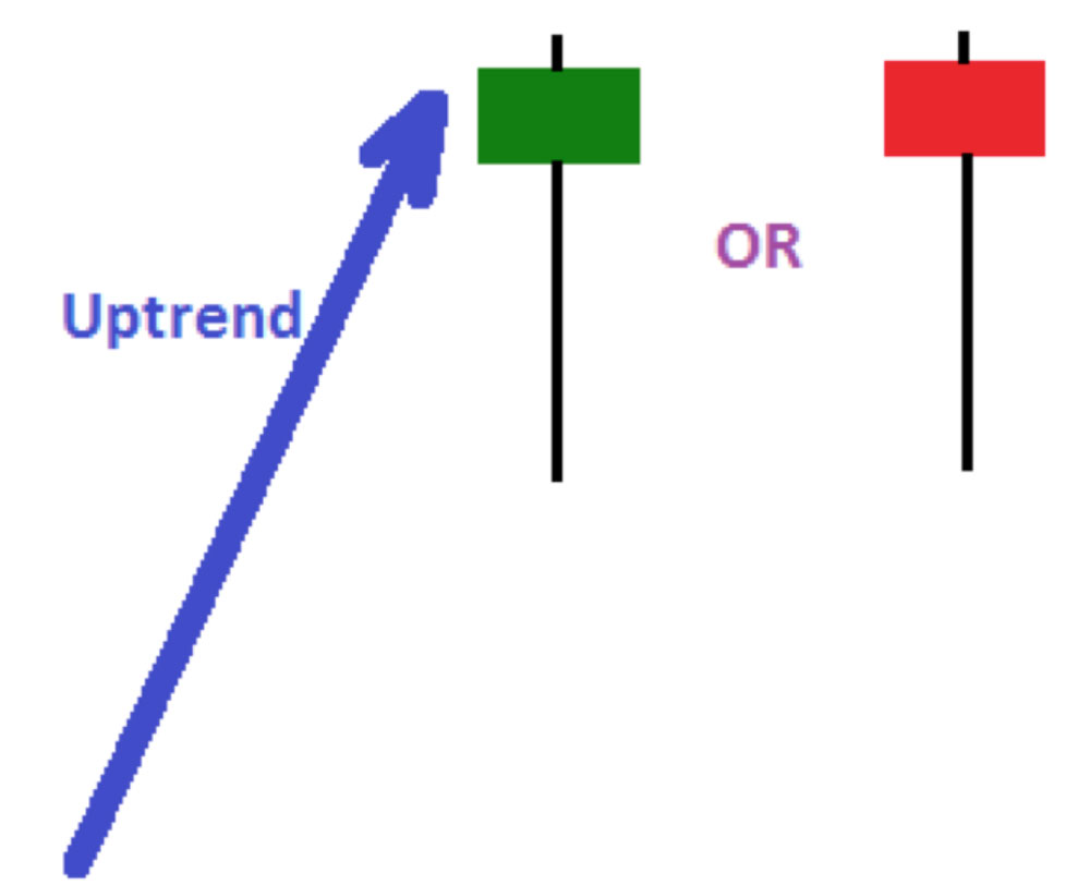
To start off, let’s look at the same candle and checkout it’s bullish and bearish versions.
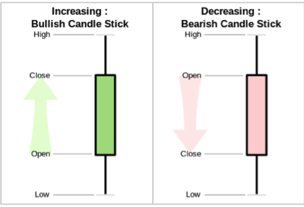
The green candle on the left, shows us that the price has increased during this time period. The thing to know is that candles can be generated for a wide range of time periods. You will also notice an ‘open’ and ‘close’ label on the graphic above. What does this mean? Well, if we were looking at one day candles in the stock market, then the candle will open at the price available during the start of the trading day. The price achieved then the stock market closed will be be shown in the candle ‘close’.
The high and low points of the trading time period are illustrated as ‘wicks’ on the candle (black line that you see above and below the green and red candles). The higher the ‘close’ is to the high point, the more confident traders are about future price increases in the next time period. The reverse is true for bearish candles.
You should know that a single candlestick will not give you the full picture to perform a technical analysis of the market. Cryptocurrency traders instead make their market predictions using a series of candles in a candlestick chart using different time measurements for candles that can span from minutes, days to weeks depending on the analysis they want to perform.
How to use Trade Volume to verify Candle meaning?
When analysing candlesticks, you also need to consider the trading volume of the market driving the price movement. If the trading volume for the time period is low, then the candle cannot be viewed as a true indicator.
How do you know if the trading volume is low?
Well, the relative strength indicator (RSI) is a good indicator to use and verify volume.
When using the RSI you should know that RSI levels of 70 or above indicate that the asset is overbought. In downward price movements, an RSI of below 30 hints that the asset is oversold.
Different types of Candlesticks for Technical Analysis and what they mean
Now you understand what candlesticks are and why trade volume is important, let’s move on to different types of candlestick patterns and their meaning hat will help you continue with your technical analysis.
Bullish Hammer Candle
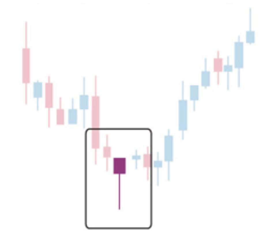
We actually saw a bullish hammer when Bitcoin hit $6,000 in early 2018. This type of candle is formed after a massive downswing.
This sort of chart is formed when the market tries to aggressively drop the price and this is met with large buying pressure. A common trait of the bullish hammer is that the bottom wick is very low (the price spikes down hard) but the main body of the candle is near the top of the candlestick.
Basically, this tells us that a big sell off happened and the market recovered quickly. Bullish hammers can be either red or green candles. It doesn’t actually matter, the main point is that the market went down a lot and rebounded strongly.
Inverted Hammer Candle
Inverted hammers are bearish and illustrate the market trying to recover but failing. It doesn’t matter if the candle is green or red. The reason why is that in either case the bulls tried to push the price up, but failed.
If you see an inverted hammer, you are best off not opening any short positions. The reason why is that the bulls have already shown that they are trying to pump up the price and may opt for an even bigger push shortly. If you spot an upward price trend after an inverted hammer, then this is a good opportunity to go long. This is especially true if the uptrend is accompanied by high volume.
Hanging Man Candle
The Hanging man chart pattern is formed when the market is raising and gets oversold. This chart pattern is bullish because it tells us that sellers tried hard to suppress the price and the bulls showed up to defend and succeed in holding the price up.
The hanging man chart pattern is positive, however, this indicator tells us that it’s likely there will be an imminent support test. Out top tip when you find a hanging man chart pattern, is to wait for a second sell off to happen and buy at the level below the wick of the candle and get a good entry.
Doji Candles
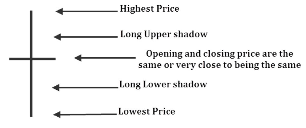
A Doji candle is formed when there is a tug of war between the bulls and the bears, which ultimately leads to the market consolidating in the middle of the candle. Often Doji candles show that neither bears or bulls have control over the market. Be careful when you see a Doji, it is very uncertain what the market may do next.
Confirmation Candles
A confirmation candle is when the price action breaks support or resistance. The first candle will move through the threshold and the confirmation candle will hold the new range. When resistance is broken, the green candles will remain above the past line of resistance and turn it into new support. In a bearish case, support will break and the red candle will dip below previous support and instead create a new resistance level.
With confirmation candles it is especially important to make sure they are made with a spike in volume. If there has been little increase in volume, then it’s likely that there will be a sudden and savage reversal.
In a nutshell, the market needs high confidence when it tries to break through resistance levels. Low volume shows a low level of confidence by traders.
Now that you know what Candles are in a Technical Analysis
You should now have a good understanding of candlesticks and know that patterns are often formed in candlestick charts. It’s when the savvy trader can interpret these patterns that the best trading decisions are made. The patterns in the charts are the indicator of where the price is going. The candlestick by themselves, show you why the price is where it is at now.
Now we will jump into two of the most important patterns to know when trading cryptocurrency.
Elliot Wave Theory
In technical analysis, the Elliot Wave Theory is often used to determine if the market is ready to go on a bull run. Traders usually only apply Elliot Wave Theory to long term charts.
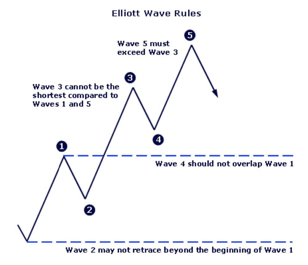
An Elliot Wave is characterised by higher highs and lower lows points. However if the wave reaches for support, then a A-B-C pattern is likely to play out. A break to the upside means that there will be an attempt to keep the five wave cycle going.
If the market goes to the downside, then this downtrend will remain until A-B-C waves form and a breakout is staged. When the price falls after the fifth wave, traders usually look for the formation of an A-B-C wave before attempting a recovery.
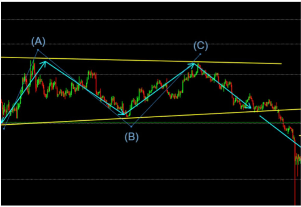
In the image above you can see an example of an A-B-C wave that failed and broke to the downside.
A word of warning: This type of technical analysis is the hardest to get become a true master at. However, those that become true masters are able to trade cryptocurrencies exceptionally profitable by only reading waves. Profitability can also be increased by using Fibonacci retracement, which helps forecast price movement sizes.
Fibonacci Retracement
Fibonacci retracement levels are ratios that market watcher use to credit areas of resistance and support. In the visualization below, you can see the Ethereum to Bitcoin ratio peak at around 0.126.
Then the price fell by 35% in just two weeks. Within the timeframe the market actually has two small bounces at the 0.618 and 0.786 levels. The bounce off these levels was capped by the Fibonacci retracement levels directly above them.
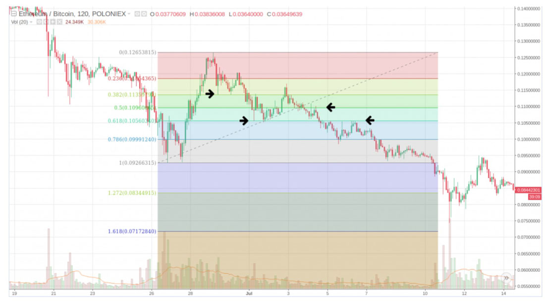
Essentially, if the market reverts back to the price level at the start of the upswing (where you should measure from) the ratio will be 1:1. Extended Fibonacci levels extend beyond this level and you can then see the retracements calculated.
Fibonacci retracement levels are sed in both bear and bull markets. Essentially, they are used to predict how high the price might go before meeting resistance or how low the price may go before finding support.
What does the canon of trading theory have to say about key Fibonacci ratios?
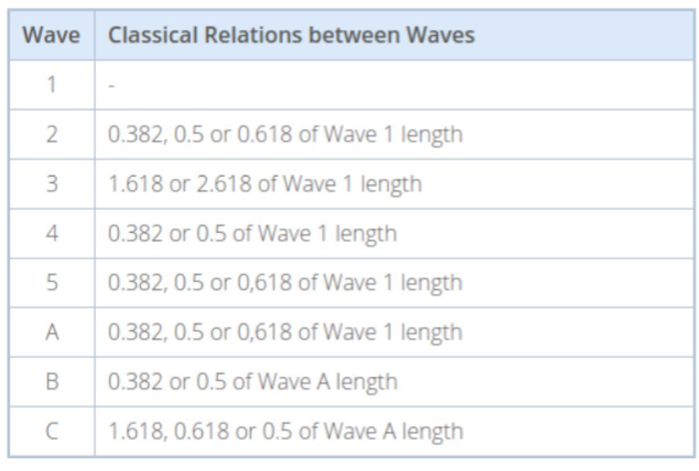
How do you use this information? Well, if the market is moving upwards and a trader sees that the first wave has formed, the trader is likely to wait for the price to go down and look for entry points at 0.382, 0.5 and 0.618 to go long.
Conclusion
Some commentators would have you believe that cryptocurrency traders are mindlessly clicking buttons and printing money. However, the goal of sites like Total Crypto is to make sure you understand that many successful crypto traders actually eat, sleep and breath, candlesticks and chart patterns.
Interpreting the patterns and candlesticks is not an exact science. However, we hope you are now well on your way to mastering chart analysis. In the final part of our three-part crypto day trading series we will show you some advanced chart patterns and reveal what they mean.
Thanks for reading and good luck in your trade with cryptocurrencies.